SB Gräv / Kaivuu
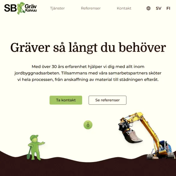
This website was made for the earthwork firm SB Gräv / Kaivuu. Stefan Berglund is already a master at what he does, so the website only needs to showcase his skill to everyone who might be in need of his services and give anyone interested ways to contact Stefan.
Colors
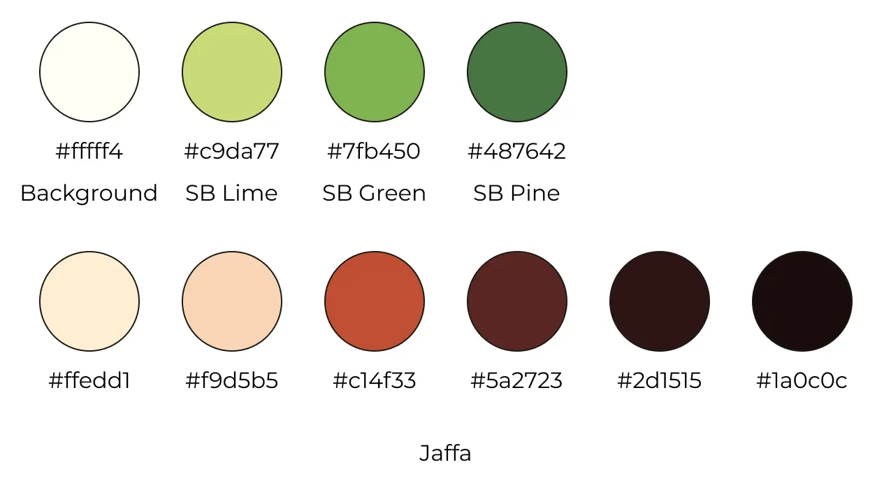
The company already had an existing logo in the shape of a green faceless builder with a cap and a shovel. Since the logo is used prominently on the company excavators other equipment, there was no need to create a new one. Therefore the process of picking colors for the site started with extracting colors from the logo. In order to limit the palette as much as possible only three colors were picked: a midtone, a dark tone and a light tone.
Since the greens were so vivid they were best used sparingly as an accent color. They were used for buttons and for the contact form. The green people also makes appearances throughout the site so they also add splashes of color where they stand.
In order to balance out the greens a complimentary palette was constructed which ranged from a light beige to a deep orange, and finally reaching a rich brown. These colors reminded me of jaffa cakes, and so the palette was named 'jaffa'.
Fonts
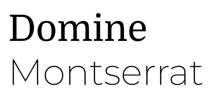
To keep things simple only two fonts were used for this website: Domine and Montserrat.
Domine is a serif font that is inspired by old fonts used in books and other print with dense text. It was specifically designed to be legible as body text on the web, but here it was used for headings instead. The slight curvature of the letters give the font a homely and friendly look which suited the site.
Montserrat is a popular sans serif font which was used for body text and buttons here due to how clean and unintrusive it is. It really shines when the thinnest line widths are used, but it works well in all weights. It's popular for a reason.
Showcasing
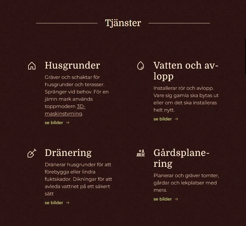
Since the main purpose of the site is to showcase what the firm has to offer, the first thing you see when scrolling is a grid of cards that briefly explains the services. The cards have a button for showing photos from past projects where related work has been done.
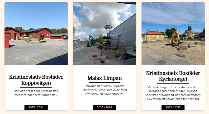
Following the list of services is a selection of past projects to show what results the customers can expect. Some of the more demanding work is on display here.
Contact
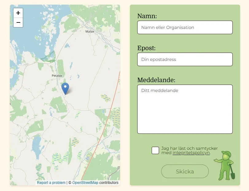
Finally a contact form to get in touch with Stefan when his services are needed. A green contact form would attract the gaze of a customer, but the green colors from the logo were too saturated to use for the form so they were given some transparency to mix with the background color. This made the text easier to read and the green person stand out more.
You can visit the website on www.sbgräv.fi.
